
Stori
Communities where everyone can thriveHybrid Studio showed an infinite amount of patience and skill as they guided us through our rebranding process. They expertly helped us bring alive our vision for the organisation and were totally professional throughout the process.
The branding and website they have delivered has exceeded our expectations and we would happily recommend them.
Formerly known as Hafan Cymru, feedback from stakeholders told us that the organisation was highly respected and exceptionally well run – but this was not the image that was being portrayed by their branding.
The name Hafan Cymru was a hinderance, often confused with Tŷ Hafan (an entirely different organisation). It was also holding them back when looking to gain business further afield.
Their logo was a dated clipart symbol, almost identical to others used by other organisations in their sector. The colour palette was purple and green, as is often used in the sector, and lacked warmth, confidence and humanity.
There was no clear sense of their brand values and no strong sense of purpose.

Firstly, the name…
We worked with the wonderfully talented brand strategist Jo Lilford at Run Jump Fly. Jo helped Hafan Cymru to solidify their vision, mission, values and purpose. Helping them to understand who they are and who they want to become. It was clear that a new name was essential to enable them to move forward effectively.
We joined at the naming stage. After many options and some time to reflect we agreed on Stori with the strap line ’Start a new chapter’.
Stori are enablers, they enable and empower people to write their own future. Turn over a new blank page. Start a new chapter in their lives.

New name, new logo
To further distance from the previous identity we dropped the use of a symbol and opted for a simple logotype. The logotype is bold, modern and lowercase. We cut off the bottom corner of the letter i to signify a turning page.
We took this corner turn idea a step further and used a colour block triangle with the logotype inside that could be appended to anything – signifying that Stori can help you turn the page.


Adding warmth
We kept the colour palette bold and simple. Working with four key colours, the hero colour is red/orange which gives warmth, confidence and individuality to the brand.


A suitable typeface
The brand font is elegant, modern and simple, softened by unique curves on the letters R, Q and K. It is easy to read at all sizes and works well in print and on screen.


A website to match
With their new bilingual website, intuitive WordPress CMS and bespoke page builder tool, Stori can now create their own page layouts from a set of predetermined content blocks.
This gives them the power to do what they need while ensuring it stays on brand.

All the guidance they need
We produced an easy to follow brand guidelines document – including brand language guide from Run Jump Fly – as well as collateral design and templates for stationery, PowerPoint etc.

Stori — Start a new chapter
Stori now have a bold, confident and warmer style that stands out in their sector.
This makes them instantly more recognisable and memorable and is a true representation of what they stand for.
Stori now has the brand confidence to grow both within Wales and beyond borders.

You might also be interested in
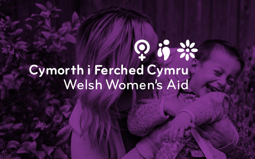
Welsh Women’s Aid
A safer world for women and children
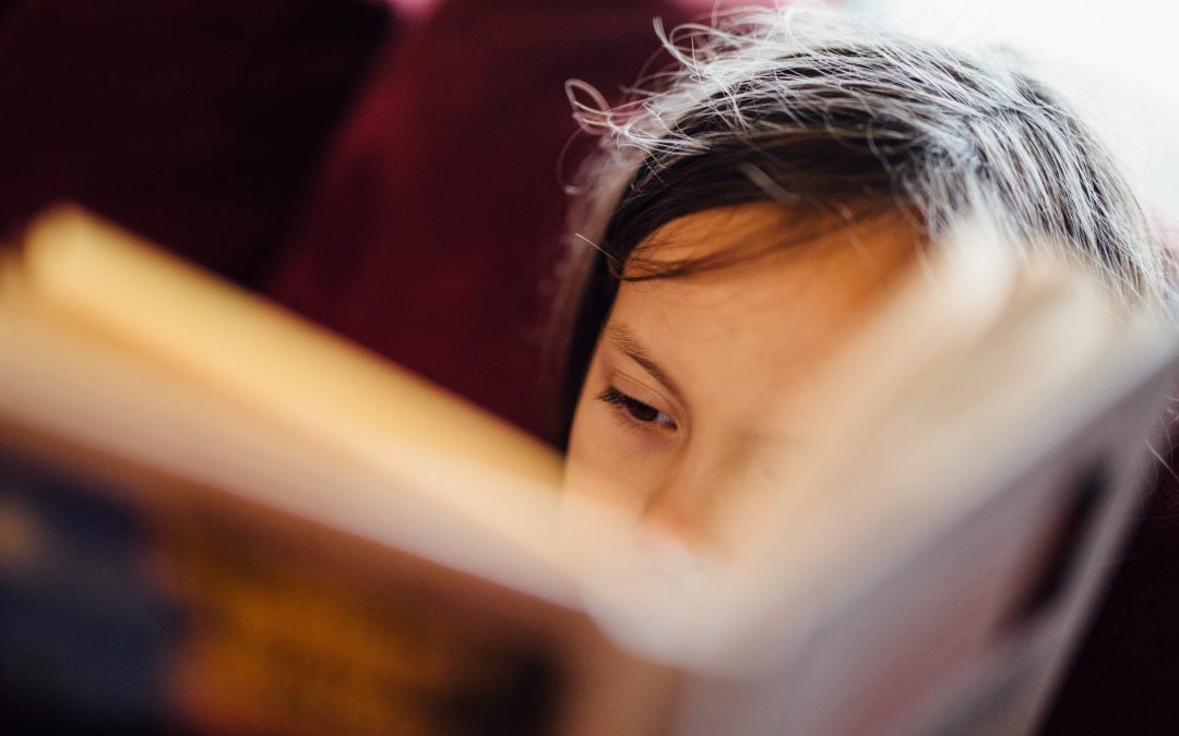
Doorstep Library
Inspiring a generation