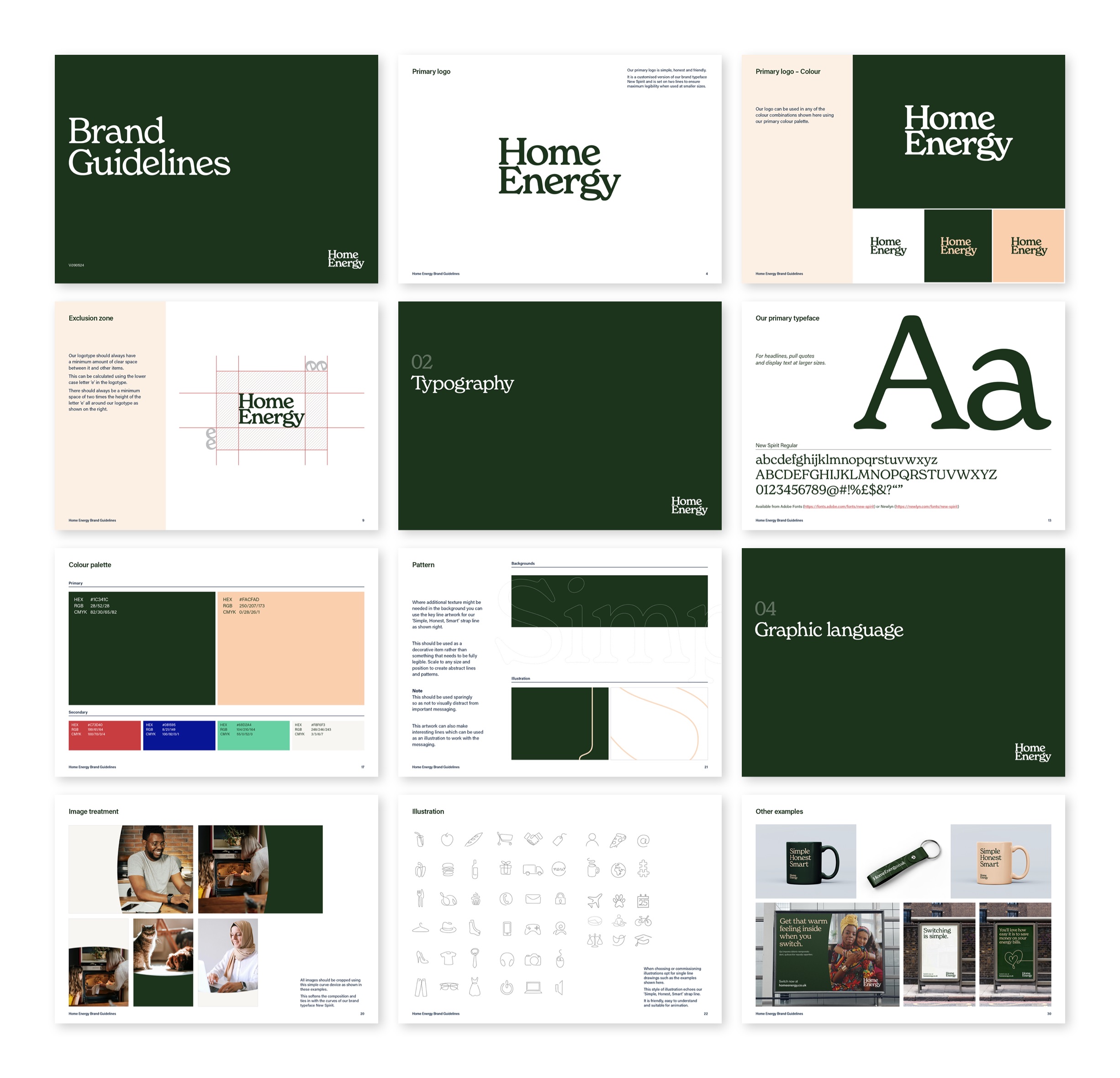
Home Energy
Humanising utilityFamily–owned consumer supplier Home Energy approached us to overhaul a dated, ineffective brand identity that was failing to register in a highly competitive market. In a landscape dominated by corporate giants, the business needed to leverage its greatest strengths: agility, simplicity and excellent customer care.
Services we provided
Understanding the challenge
We initiated the project with an intensive discovery phase to articulate their authentic brand values, providing a solid foundation for the creative work to follow. By understanding the wider market, we identified a clear path to meaningful differentiation for Home Energy.
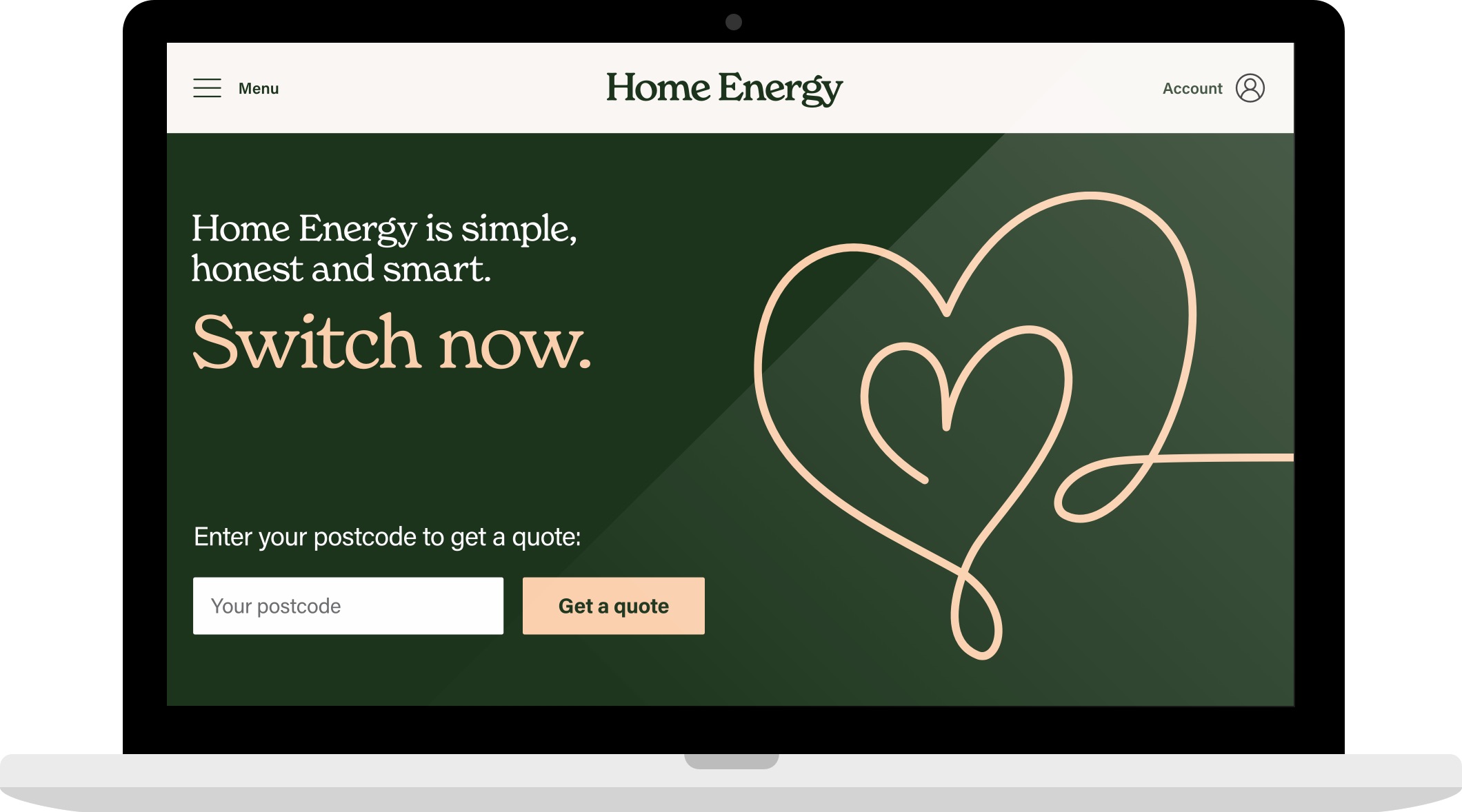
Zag while others zig
While the sector is crowded with cold, clinical geometric typefaces, we bucked the trend by introducing New Spirit – a warm, beautifully expressive serif font. Its organic, flowing curves evoke instant familiarity, comfort, humanity and safety.
These are the very qualities consumers look for in the energy provider that powers their homes.
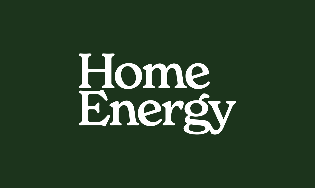
Flexibility and simplicity for impact
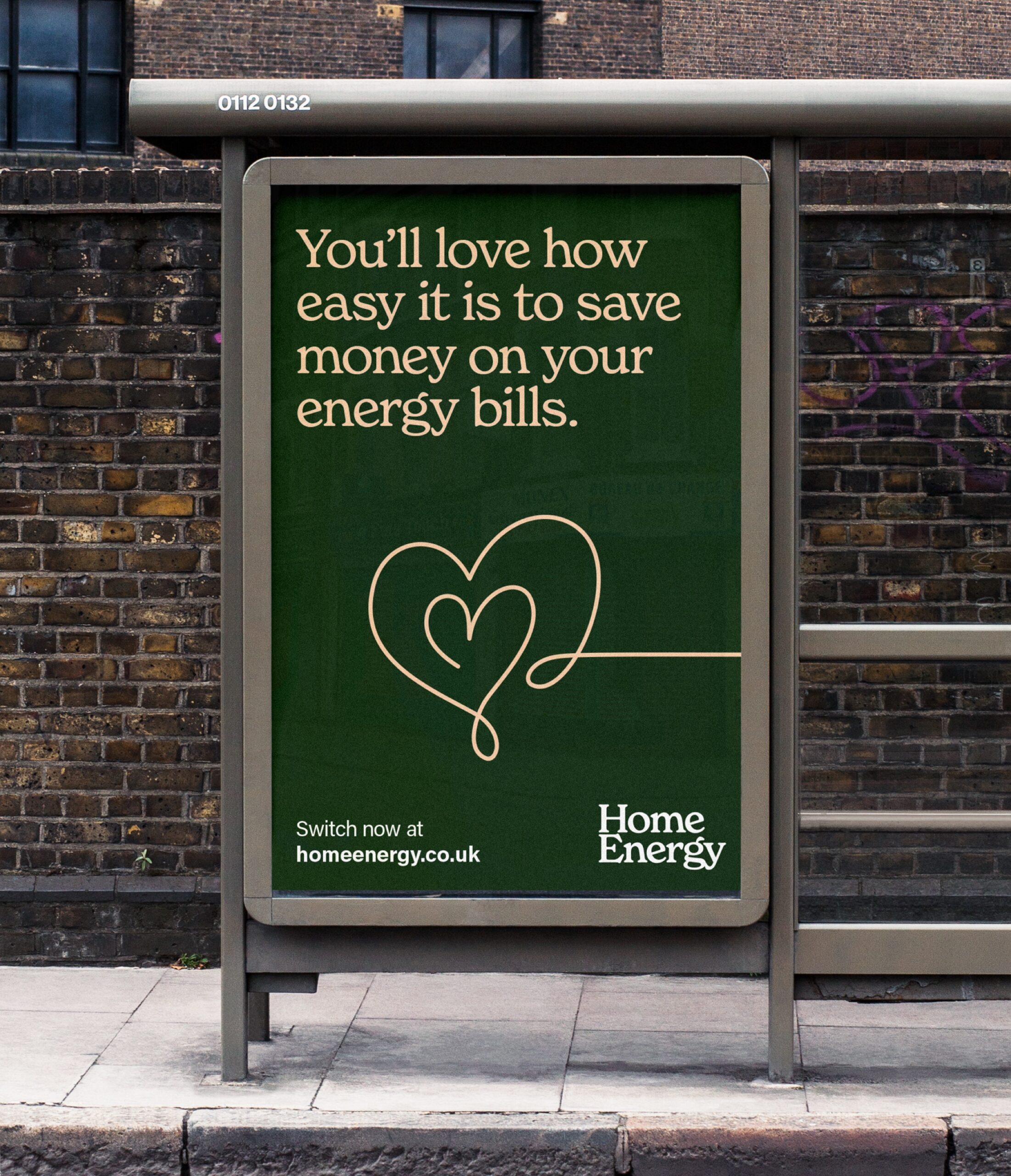
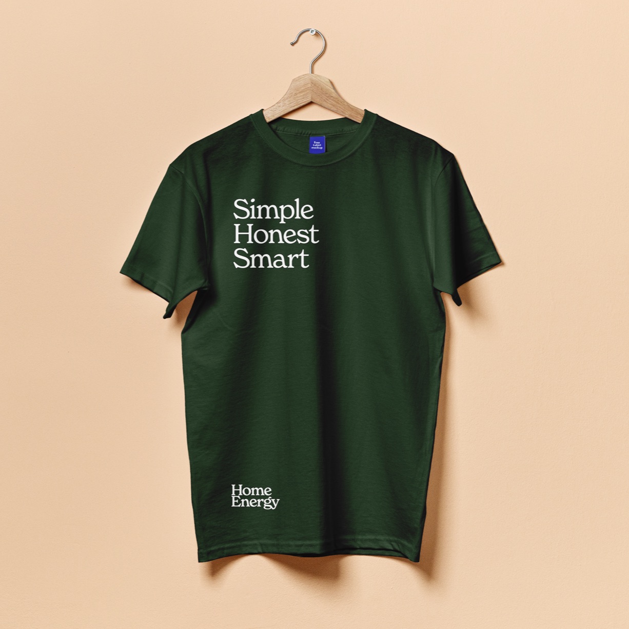
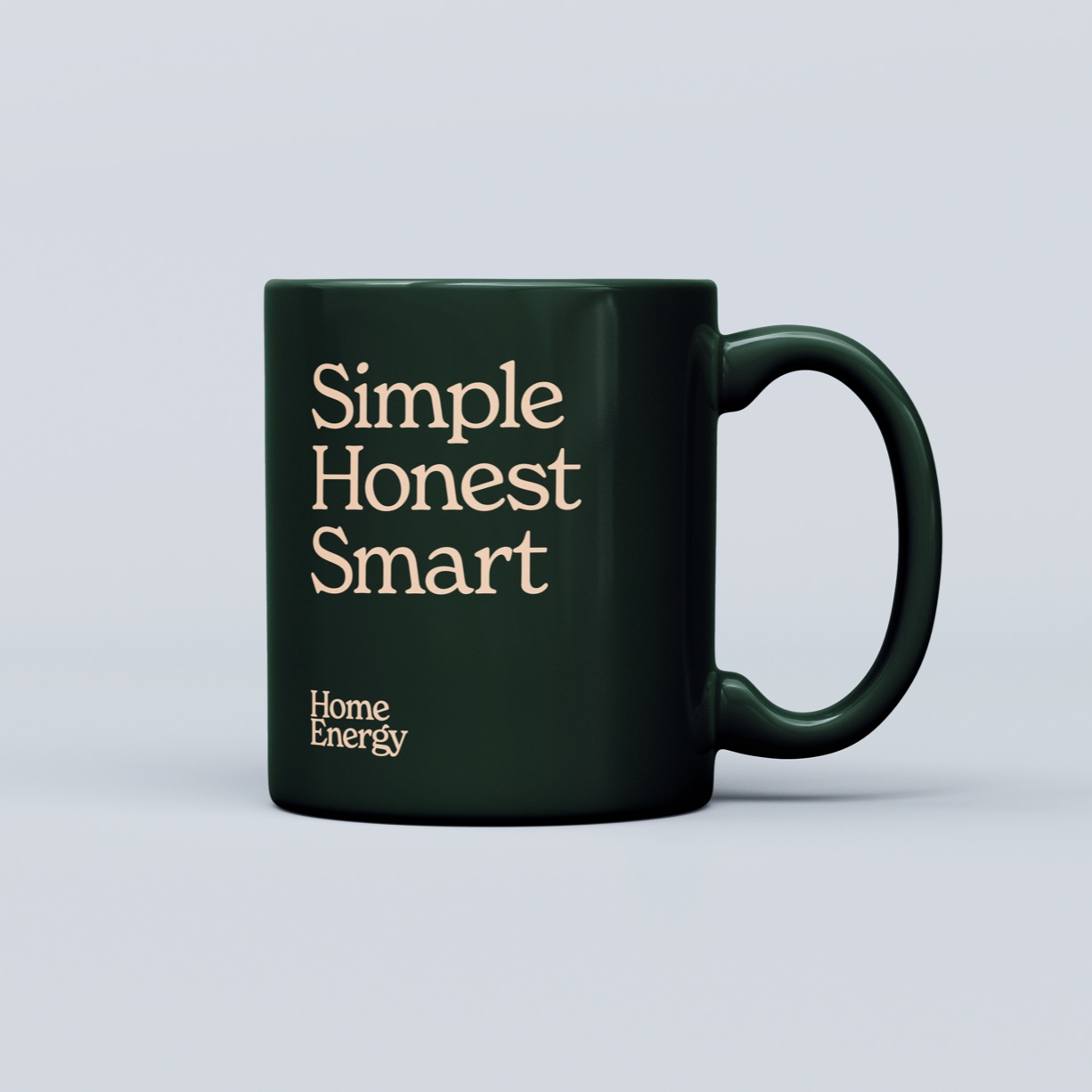
In a world of constant visual stimulation we deliberately kept the brand flexible. It can be used with photography and illustration or it can be stripped right down to bold typographic statements.
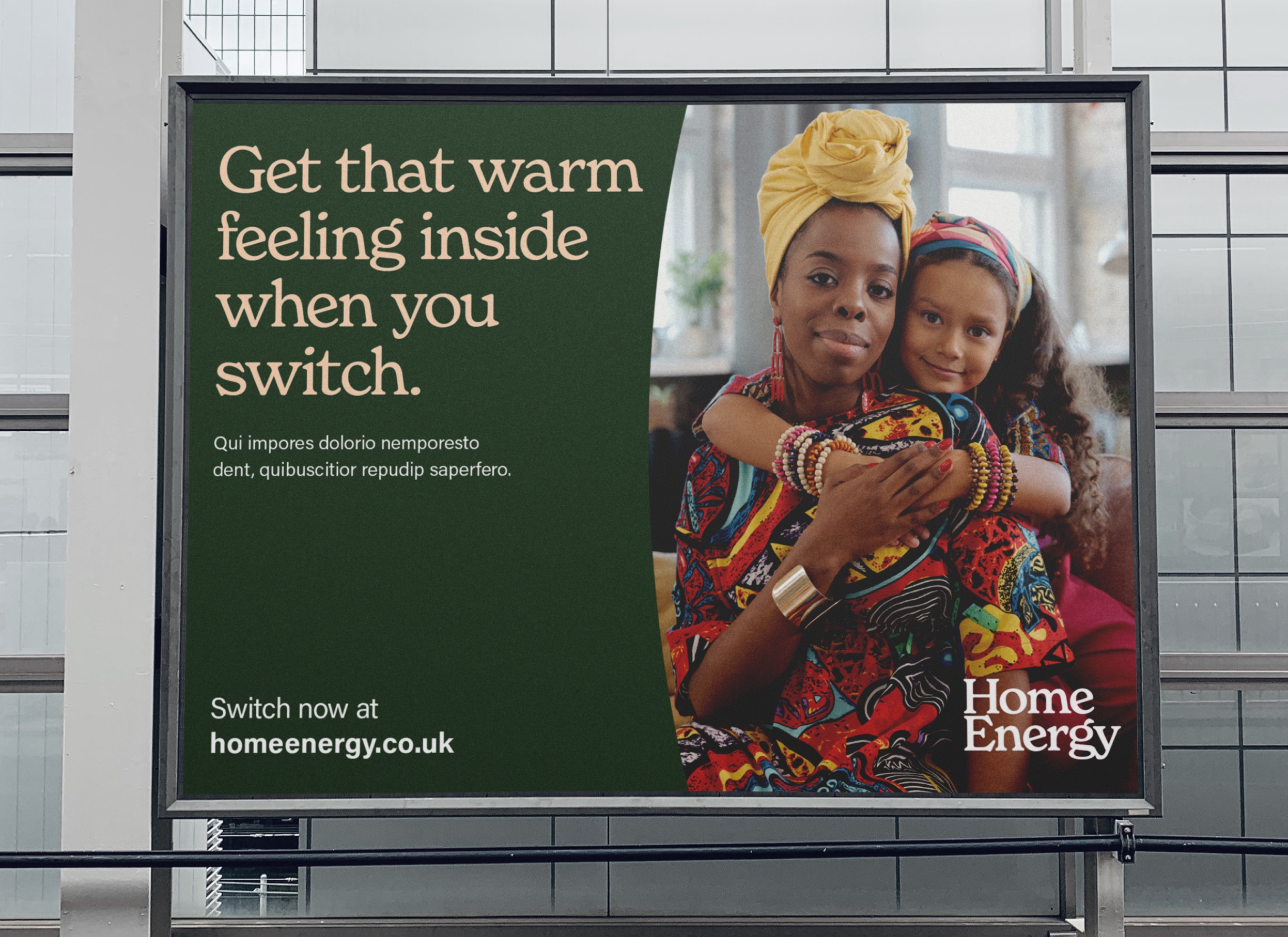
Humanising through illustration
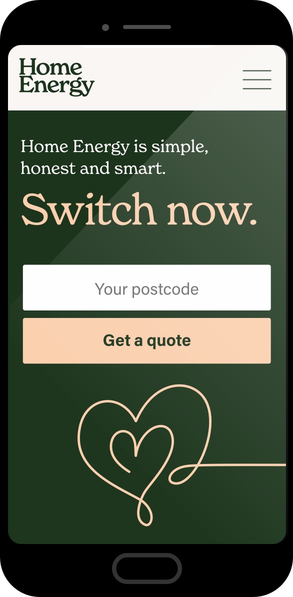
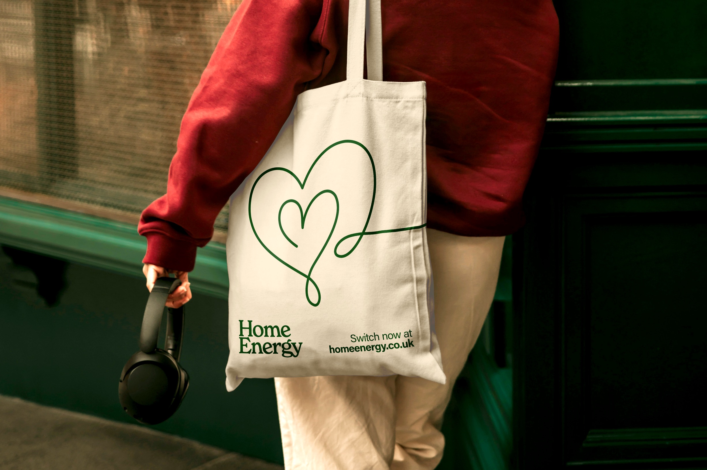
We extended this human-centric narrative through a suite of minimalist, single–line hand–drawn illustrations that add an approachable, tactile and organic quality to the digital experience.
Owning your brand colours
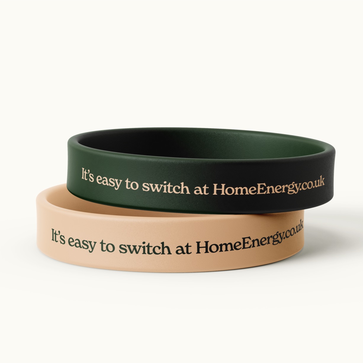
The colour palette deliberately departs from the competition, balancing a comforting, deep forest green with a soft, inviting warm pink.
And on you go
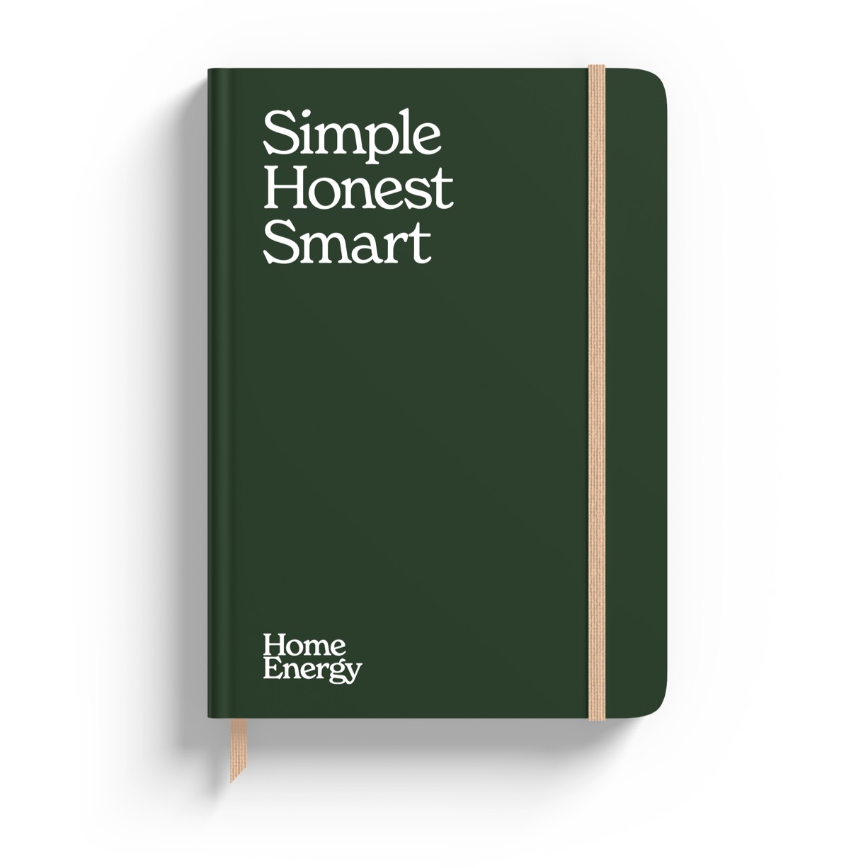
The new brand repositions Home Energy as a trusted, modern household name. Bold and memorable, it stands out from the crowd.
The brand toolkit and guidelines we created empower Home Energy to roll out their brand with consistency and ease, whether they are working with their in-house marketing team or employing external suppliers.